The flow to track your jobs
I'm a UX/UI & Product Designer based in Atlanta, GA, leading with a human-centered mindset and bringing over 10 years of design, project management, and leadership experience. My inclusive approach prioritizes diverse user needs in crafting solutions, specializing in optimizing user experiences across various screen sizes.
Outside of design, I find joy in cooking and exploring new activities like kayaking and zip-lining. Let's connect and create meaningful user-centric designs together!
There is a gap in good personalized podcast recommendersPodcast discovery is still driven largely by word of mouth and listeners are more casual than habitual (source: https://medium.com/the-business-of-content/the-race-to-build-a-podcast-recommendation-engine-and-why-it-matters-7aeb9cf99a29)PodMyne recommends podcasts based on user inputsCategory (ie. Comedy, Sports, News, Technology)Description of what they’re in the mood to listen to
A multidisciplinary UX and Product Designer with expertise in project management, team leadership, business analysis, and six sigma black belt certification. I'm passionate about usability, interaction design, and accessibility. Using data and insights, I create seamless experiences that drive business impact. Through research, testing, and thoughtful design, I turn complex challenges into simple, user-friendly solutions.
The wire flow organized our ideas of how our solution was going to be organized in our prototype. Using the wire flow, we discussed where each feature would live in the prototype.

Shantel likes to browse online store inventory with easy and simple purchases.
I'm a UX designer based in Atlanta, GA. My passion has always been in art, design, and film. I was always amazed at how an artist can bring life to paper with a line or a brush, how a designer can also bring on paper with a mouse and keyboard, and how the film industry can bring entertainment from make-believe and visual effects.
Now as a UX designer
I can bring the wants and needs of my users who are engaging with the product and this is my passion as a UX professional. Every day I strive to be a champion for the wants, needs, and expectations of the user. I leverage my skill set to create digital products that are intuitive and easy to use. I specialize in enhancing experiences through roadmapping, research, testing, analytics, and streamlined design. And most importantly, I generate results by placing the user in the center of every decision I make
Applicationer


Seeks to simplify the job application process by consolidating tracking and information in one place. Rather than keep track of multiple applications across multiple sites, Applicationer seeks to streamline these processes and keep active applications organized and accessible.
PROJECT OVERVIEW
Project Goal:
Applicationer wants to:
-
Wants to help users stay organized while job searching
-
Wants users application process easier
-
Wants users to keep up with jobs applied for
-
Wants users to be able to set goals and write notes
Tools: Figma; Miro; Pen & Paper; Zoom
Deliverables:
User Research; Problem Statement; Design Hypothesis/approach to solutions; Personas, User Flows; User Journey; Highfidelity Prototype and Clickable Prototypes.
Time: 3 weeks
MY ROLES:
-
Project manager
-
Develop project plan
-
User research
-
Analyze data from research
-
Problem statement
-
Affinity map
-
User journey
-
Wireframe
-
Prototype

RESEARCH
Evaluating our users
-
We interviewed 3 college graduates and 3 career changers
-
Three goals we had in mind are
-
Identify their pain points
-
To learn more about their current strategies when applying to jobs
-
What resources they found helpful in their search
-
-
When applying for a job, what pieces of information do you pay attention to and what would you like to save to refer back to?
-
What do you normally do after you apply for a job?
-
What is your strategy when applying for jobs?
“Sometimes I forget what I apply to when applying to hundreds of jobs”
Our competitive/comparative analysis

Our competitors takeaway
Huntr:
-
Provides a general job tracking application process, but requires a subscription to get full access to their complete features.
Teal:
-
Teal strives to create a communal experience by providing paid features with professional support and create networking opportunities
-
(ex. Career insights, live events, accountability cohort, one-on-one career planning sessions, slack channel)
-
Jibber Jobber:
-
JibberJobber has a lot of functionality but leaves most of the work to the user. Its lack of professionalism and functionality results in a lack of trust.
DEFINE
Problem Statement
Job seekers need a comprehensive tool that will help them keep track of their application process in detail so that they can effectively set and keep to a career path for themselves.
HOW MIGHT WE...
-
Offer job-seekers an effective way to organize information related to the job posting
-
Keeping track of important dates (interviews)
-
Help job seekers keep track of specific resumes and cover letters they use for each application
-
Keep track of information that may relate to their interview
Take a look at users qualitative information

-
Keep track of interviews using Google Calendar.
-
Users use Microsoft Excel to keep track of details relating to job applications.
-
Users use different resumes/cover letters based on the job descriptions.
-
Most users find that networking is an essential part in their job search
Meet our New Graduates

Meet our Career Changer

Check out more of my work below!

.jpg)
.jpg)


Their journey without Applicationer

Without Applicationer, our users are:
-
Having difficulty keeping track of all of the user's application materials.
-
Missing important information when there are multiple interviews coming up.
-
Feeling overwhelmed getting ready for interviews.
-
Not able to have important information in hand for interviewing easily.
Their journey with Applicationer

With Applicationer, our users now:
-
Has a way to keep track of jobs they applied to.
-
Able to save relevant information.
-
Have the ability to review saved applications on demand.
-
Set reminders to send thank you emails and follow up.
-
Update application status.
The flow our users will take
Our new user path to create a new account

Our new user path to track a job application

DESIGN
Wireframe


How I keep track of my jobs
The video above will show you how to:
-
Add a new job to your job tracker
-
Move a job to archive
-
View your profile
-
Add/edit your goals
Style guide for our engineers/developers

Applicationer feature prioritization
-
Having a user profile that saves data about applications and provides feedback about your work history. “Career Insights” would allow users to visualize underlying trends about their applications that may inform their career path.
-
Having the ability to save different resumes/cover letters you use to apply to different jobs. This would allow you to keep track of the information you provided for specific applications, and expedite future applications by already having past information at hand.
-
Having automated reminders - when to write a follow-up email, thank you email, etc
-
LinkedIn connectivity- Job seekers’ primary tool for networking. Being able to connect a contact list from LinkedIn would make it easier to associate contacts for referrals.
What should Applicationer do next?

-
Allow users to upload their resume and cover letter in .pdf format and a tool that highlights keywords
-
Import information from Google Calendar
-
Create a success story section to allow users to inspire and encourage others
-
Building functionality that suggests a fair salary for an applied-to position, and other related jobs in the field or area of interest
-
Make sure the site is accessible to users that are color blind
-
Make sure the site layout is consistent (i.e consistent shape on all tabs & buttons)
Reflecting
I was excited to be part of a project that our client is an alumnus of General Assembly studying User Experience Designer. She wants to help fellow grads and career-switchers to be able to track jobs they applied to.
I was pleased with the outcome of the project and the different things I learned during the research and users interview. I am looking forward to continuing working on this project in my spare time and also create the mobile responsive prototype.


Aaliyah is a recent college graduate with a Bachelor’s degree in Journalism. Aaliyah is seeking a position with a company that will allow her to grow as a writer but is having difficulty finding the perfect job. She wishes there was an application that would make her job search process easier.
Frustrations
-
Not having all of her information in a single, accessible space
-
Losing information after applying due to the volume of applications sent out
-
Not yet having built an effective network
Aaliyah Johnson (college graduate)
GENDER
AGE
Female
26
OCCUPATION
Unemployed
LOCATION
Atlanta, GA
If I had everything streamlined for me it could make the applying process easier.
-
A way to keep track of a large number of applications she sends out
-
Make a list of companies of interest in order to plan her career and plot a path to her dream job
-
Have quick access to relevant information in order to prep for interviews
Needs

Jorge is currently working as a Project Manager. After working in this position for a few years, he feels like it’s time for a change. Unfortunately, he cannot dedicate as much time as he would like to his job search. Jorge’s job search focuses on quality, not quantity.
Jorge Lopez (career changer)
Needs
-
A way to sort and prioritize job applications of interest
-
A simple and informative solution that displays relevant job and networking information
-
A method to keep track of his busy schedule, taking into account his work commitments and scheduled interviews
Frustrations
-
Not having a simple way to access information about different jobs in the same place
-
Having to keep track of multiple time commitments in different places
-
Keeping track of his contacts and applications on different platforms
Trying to find a new career while managing my job can be really challenging.
GENDER
AGE
Female
26
OCCUPATION
Unemployed
LOCATION
Atlanta, GA
Pet Park
Created an eCommerce web prototype to give users the digital capability to place orders.

Applicationer: Client Website Design
Applicationer currently exists as a bare-bones MVP. The goal is to build it out into a more fully-formed website.
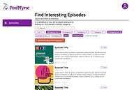
PodMyne
Create a unique product and build an MVP to display our product concept.

.jpg)
.jpg)

PodMyne


Art Institute of Chicago
Art Institute of Chicago: Website Redesign
A digital solution to capture youth interest within the museum.

Applicationer

Applicationer
Client Website Design
Applicationer currently exists as a bare-bones MVP. The goal is to build it out into a more fully-formed website.
.jpg)
PodMyne
Podcast Recommender
Create a unique product and build an MVP to display our product concept.

Wireframes
After completing the mid-fi prototype. I pass it off to the next team to:
-
Set up a feedback session with stakeholder/relevant team
-
Incorporate feedback into the design
-
Usability test
-
Create prototype
Joan will have the ability to see where she’s at while creating a campaign. She will also have the ability to click on a step she already completed.
.jpg)
She is able to save where she’s at and the previous information she added. If she closes the page or goes back to the dashboard, she can go back to what she was working on
.jpg)
She will have a visual diagram of campaigns she have currently or in the queue to run.
.jpg)
Ability to save audience for future use
She is able to see what tiers certain selections are available for with the ability to upgrade when she click on it.
Ability to use previous save audience
She is able to see the audience information she selected and how many users she will reach.
When she click on “dashboard”, It will take her back to her campaign dashboard. However, if she didn’t click on save, whatever she was working on will not be save.
.jpg)
.jpg)
If she have existing creatives, she have the ability to use it.
.jpg)
She will be able to know the total budget she entered for the channels.
.jpg)
Option to save payment information
While completing the payment section, she will be able to see/view a summary of the budget information she input previously
She will have the option to use a payment method that was save. She will have to enter the CVC number for security protection
.jpg)
Before submitting her campaign, she will be able to see what she selected and input. She will also have the ability to edit anything if needed (Ex: the creative she skip, she can go back and do it if she want to.
.jpg)
Ideation & Design


Platform Revolution: Redesigning Home Depot’s Marketing Portal
UX Designer


The challenge: A mission to transform campaign management
The Home Depot is a leader in home improvement, but its internal marketing platform was falling short. Users struggled to plan and execute effective campaigns due to a lack of essential features.
Goal
To create a seamless, intuitive experience that empowers both internal teams and external users to:
-
Define objectives
-
Select target audiences
-
Build impactful campaigns—without unnecessary complexity
My Role: UX Designer
Team: UX Researchers, Developers, Product Owner, Stakeholders
Company: The Home Depot
Tools: Figma, FigJam, Jira, Miro, Zoom, Google Slides
Project Duration: 4 Weeks
Identifying the Problem: A Roadblock to Success
The platform lacked key capabilities that allow users to:
-
Define campaign objectives
-
Target specific audiences effectively
-
Seamlessly manage the campaign creation process
Without these foundational elements, users faced confusion, inefficiency, and poor engagement with their marketing efforts. It was clear: The platform needed a transformation.
My Game Plan
Before diving into solutions, I needed to fully understand the existing platform, its pain points, and user expectations.

Competitive Analysis
User Personas
Defining key user needs and behaviors to align the redesign with real-world use cases.
Evaluating market trends and competitor strategies to identify opportunities for improvement.
Wireframing Key Solutions
Presenting & Iterating
Sharing findings with the team, gathering feedback, and refining the design accordingly.
Developing initial design directions based on insights from research and analysis.
Competitive Analysis
I analyzed The Home Depot’s top competitors and found:
-
Lowe’s leverages personalized marketing.
-
Amazon & Walmart run robust advertising campaigns.
-
True Value & Ace Hardware lack comprehensive marketing strategies.
Key Insights:
-
Clear objectives define the campaign’s purpose.
-
Audience selection tools target the right users.
-
Creative flexibility allows iterative ad designs.

Refining the Flow: From Gaps to Growth
Current Flow
The existing campaign setup flow was designed to be straightforward, but it lacked key steps that would help users create more effective campaigns. Without these essential details, users often find themselves confused or missing critical inputs, leading to inefficiencies and frustration.
Current Flow Breakdown
-
Package Information – Users select their campaign package, but there’s limited guidance on choosing the best fit.
-
Campaign Details – Basic details are entered, but key fields for optimization are missing.
-
Payment Details – Users complete their payment, yet they don’t have a clear breakdown of what they’re paying for.
-
Review Order – A final confirmation step, but lacks a way to easily edit or refine campaign details.
-
Completion – The campaign is submitted, but there’s no post-launch guidance or performance insights.
The Problem
-
Lack of guidance – Users struggle to make informed decisions.
-
Missing optimization steps – Key inputs that improve campaign success are absent.
-
Limited flexibility – Users can’t easily adjust campaign details before finalizing.
This flow needed a more intuitive, user-friendly approach to empower users and ensure a seamless, effective campaign creation process.

New & Improved Flow
To fix this, the new flow introduces essential steps that align the process with campaign goals, ensuring a more strategic and results-driven approach.
A Step-by-Step Path to Success
-
Campaign Objective – Define the purpose of the campaign to establish clear goals.
-
Audience Selection – Identify and target the right users for maximum impact.
-
Channels & Tactics – Choose the most effective marketing approach to reach the audience.
-
Creative – Design engaging visuals that resonate with users.
-
Billing Details – Finalize payment information for seamless processing.
-
Review – Double-check all campaign details before launch.
-
Completion – Successfully launch the campaign with confidence.
By introducing these structured steps, users gain greater control over their campaigns, ensuring they are goal-oriented, strategic, and optimized for success. This flow transforms campaign creation from a guesswork-driven process into a guided, intuitive experience— leading to better results and higher efficiency.

Proto-Persona: Meet Latoya: A CEO on a Mission

"I just want a simple, effective way to create campaigns that reach my audience. If I could set clear objectives and save my target groups, I’d save so much time and effort."
Latoya Johnson
Occupation: CEO, Toya’s Clothing Company
Age: 37
Location: Chicago, IL
About:
Latoya is a driven entrepreneur running Toya’s Clothing Company. With the holiday season around the corner, she’s eager to launch targeted marketing campaigns to reach the right audience and maximize sales. But there’s a problem—her current platform lacks essential tools to set clear campaign objectives and effectively target customers. Latoya isn’t looking for just another tool—she wants a solution that empowers her to grow her brand with confidence.
Goals:
-
A seamless, step-by-step campaign creation process
-
The ability to save and reuse audience data for future campaigns
-
A user-friendly platform that makes marketing effortless
Challenges:
-
No way to define campaign objectives
-
Limited audience targeting options
-
Complicated and inefficient campaign setup
Discovery Workshop & Affinity Map
I facilitated a workshop with 3 stakeholders, 2 product managers, and 2 designers.
Key takeaways:
-
The campaign objective should dictate the user flow.
-
Users should have the option to skip the creative step and return later.
-
The upgrade process should be clear and contextual.
-
Business rules should dynamically guide user decisions throughout the process.

Sketching the Vision: Bringing Ideas to Life
With a deep understanding of Latoya’s challenges, I was ready to translate insights into action. My first step? Sketching the blueprint for a seamless, intuitive campaign platform. Every decision revolved around four key solution goals:
-
Objective-Driven Flow – The campaign’s purpose should guide the entire user journey.
-
Flexible Creative Process – Users should have the freedom to skip the creative step and revisit it later.
-
Effortless Upgrades – The platform should provide clear, contextual guidance on available enhancements.
-
Rule-Based Configurations – Business logic should inform user selections at every stage.
While refining the sketches, I also focused on maintaining consistency with the existing platform to ensure familiarity for users. After presenting my initial concepts to the team, valuable feedback surfaced:
-
Users need visibility into their active and upcoming campaigns – A dashboard feature should help them track progress at a glance.
This insight shaped the next phase of my design, ensuring a user-centered approach that balanced flexibility, clarity, and efficiency.
Current platform to create campaigns


Sketches for the new platform


Check out more of my work below!
Wireframes : A Seamless Campaign Creation Experience
I translated my sketches into wireframes using Figma, ensuring an intuitive experience.
The new features enabled users to:
-
Navigate between completed steps and edit information effortlessly.
-
Save progress automatically and resume without losing work.
-
Access visual representations of active and upcoming campaigns.
-
Save, reuse, and manage audience selections with transparency.
-
Upgrade campaign features with one-click tier adjustments.
-
Preview and confirm selections before submission.
By prioritizing clarity, efficiency, and flexibility, the platform evolved into a powerful, user-friendly tool. With these intuitive features, Latoya can focus on what truly matters: creating impactful, data-driven marketing campaigns with ease.
A Clear Path to Success

1
2
1
Real-time Progress Tracking – Latoya always knows where she is in the campaign setup. She can revisit any step to make updates seamlessly.
2
Save Anytime, Anywhere – Whether she closes the page or navigates away, her progress is automatically saved, ensuring she never loses her work.

3
3
Campaigns at a Glance – A visual dashboard keeps all her active and upcoming campaigns organized in one place.
Smart, User-Centric Features

4
6
7
5
4/7
Reusable Audiences – Latoya can save and reuse previously created audience groups, saving time and effort.
5
Targeting Insights – She can see audience details, including the estimated reach, to refine her strategy.
6
Flexible Upgrades – If she wants to level up her campaign, she can easily view tier options and upgrade with a single click.

8
8
Latoya can return to the dashboard anytime without losing her progress.

9
9
Creative Control – She has the freedom to skip the creative step and add it later or use existing assets if available.
A Hassle-Free Checkout Experience

10
11
12
10/
12
Secure Payments – Latoya can use a saved payment method, with an added layer of security requiring only her CVC.
11
Budget Transparency – A clear summary of her budget appears during checkout, ensuring no surprises.

13
13
Last-Minute Edits? No Problem. – Before submitting, she gets a full review screen to double-check selections and make any necessary changes—such as completing a creative step she previously skipped
Looking Back
Owning the redesign of The Home Depot’s marketing portal was a rewarding experience. Leading workshops, synthesizing feedback, and collaborating cross-functionally strengthened my skills in:
-
Leadership & Stakeholder Communication
-
Strategic Problem-Solving
-
User-Centered Design & Iterative Prototyping
If I had continued working on the project, my next steps would have been:
-
Conduct stakeholder feedback sessions to refine the design further.
-
Develop high-fidelity prototypes for a polished, interactive experience.
-
Perform usability testing to validate design decisions.
-
Implement final refinements and launch the updated platform.
Through this project, I enhanced my ability to design solutions that balance business goals with user needs—creating a marketing platform that truly delivers results.
Refining Your Search: A simpler way to find what you need
UX Designer I UX Researcher I Platform


The Challenge:
At The Home Depot, internal teams were wasting up to 50% of their workday searching for documents and resources. The average search took 18 minutes per document, making the process both frustrating and inefficient.
The Problem:
The platform’s outdated search experience lacked advanced filtering capabilities. Users had to rely on broad keyword searches and manual scrolling through long lists of results. This slowed workflows, reduced productivity, and increased user frustration.
Goal:
My goal was to design a filtering feature that would help users quickly locate the right documents, eliminate unnecessary steps, and create a streamlined, intuitive search experience that directly improves workflow efficiency.
My Role: UX Designer & UX Researcher
Team: UX Designer, UX Researcher, Developers, Product Manager, Stakeholders
Client: The Home Depot
Tools: Figma, FigJam, Jira, Miro, Zoom, Google Slides
Project Duration: 3 Weeks
My Game Plan: A Strategic Approach to a Seamless Filter Experience
The absence of a filtering system made finding information overwhelming. Some team members spent hours or even days trying to locate what they needed. This severely impacted productivity and morale.

Develop Proto-Personas
Understand user behaviors, goals, and frustrations.
Facilitate a Collaborative Design Studio
Conduct Usability Tests
Validate designs through hands-on testing and iteration.
Bring stakeholders, designers, researchers, and product managers together to co-create solutions.
Outcome: A User-Centric, High-Impact Solution
By grounding my approach in research, collaboration, and validation, I ensured the filter feature was not just another add-on but a transformational tool that optimized workflows, reduced search time, and delivered a frictionless experience for users.
01
Proto-Persona
I created proto-personas based on internal interviews and user observation. This helped align our design direction with real-world user challenges—focusing on how users search, what they need to find, and what slows them down.

02
Design Studio
To kick off the ideation phase, I led a design studio workshop with product managers, developers, designers, and stakeholders. Together we:
-
Brainstormed multiple filtering mechanisms
-
Sketched initial ideas
-
Voted on the most viable concepts
This collaboration established consensus and a clear direction forward.

03
Wireframing the solution
The journey to refining the filter experience started with a straightforward concept: a single search box combined with sorting. This approach was functional but had limitations—users needed more control over their searches to quickly find the exact information they needed.
Iteration 1: The Single Search Box & Sorting

I began with a clean, intuitive design, allowing users to search globally across all data and sort results. While this solution worked, it lacked precision—users often found themselves scrolling through irrelevant results, slowing down their workflow.
The Key Insight: A Small Change, Big Impact
After presenting initial wireframes, a key opportunity emerged:
-
Let users filter by individual columns, instead of relying on a single global search box.
This detail dramatically improved the search accuracy and usability of the feature.
Final Design: Precision at Every Step
The final wireframes introduced column-specific search functionality, allowing users to:
-
Search within individual columns instead of scanning the entire dataset
-
Combine multiple filters at once for more targeted results
-
Reduce search time significantly, creating a smoother, frustration-free experience
Outcome: A Smarter, More Efficient Search Experience
This small but powerful tweak transformed the filter experience, making it more intuitive, precise, and efficient—a direct reflection of user needs and iterative design thinking in action.
04
Explore the Interactive Prototype!
With wireframes approved, I built a clickable interactive prototype to demo the feature’s flow and functionality. This prototype became the focal point for feedback from developers, stakeholders, and users.
05
Usability Testing & Key Takeaways
To validate the design, I conducted usability testing with 7 users. Their feedback shaped the final improvements:
-
Filter Indicator – Users needed to see which filters were active at a glance.
-
Multi-Criteria Filtering – Filtering by multiple attributes at once was a must-have.
-
Export Functionality – Users wanted to download filtered results for offline use.
These refinements ensured that the final feature was intuitive, powerful, and truly user-friendly.

Looking Back: Lessons & Growth
This project strengthened my skills in:
-
Leading design studios and cross-functional workshops
-
Conducting research and synthesizing insights
-
Building and testing prototypes
-
Presenting UX decisions to cross-functional teams
If I were still on this project, my next step would be to support developers during implementation and gather post-launch feedback to guide future iterations.
Understanding the Roadblock
Our platform lacked an effective filtering system, making searches frustrating and overwhelming. Team members often spent hours—sometimes even days—navigating through an unstructured system.